Peter the Rock Community Building Projects LLC 2026
@STERLING-ARTISTRY
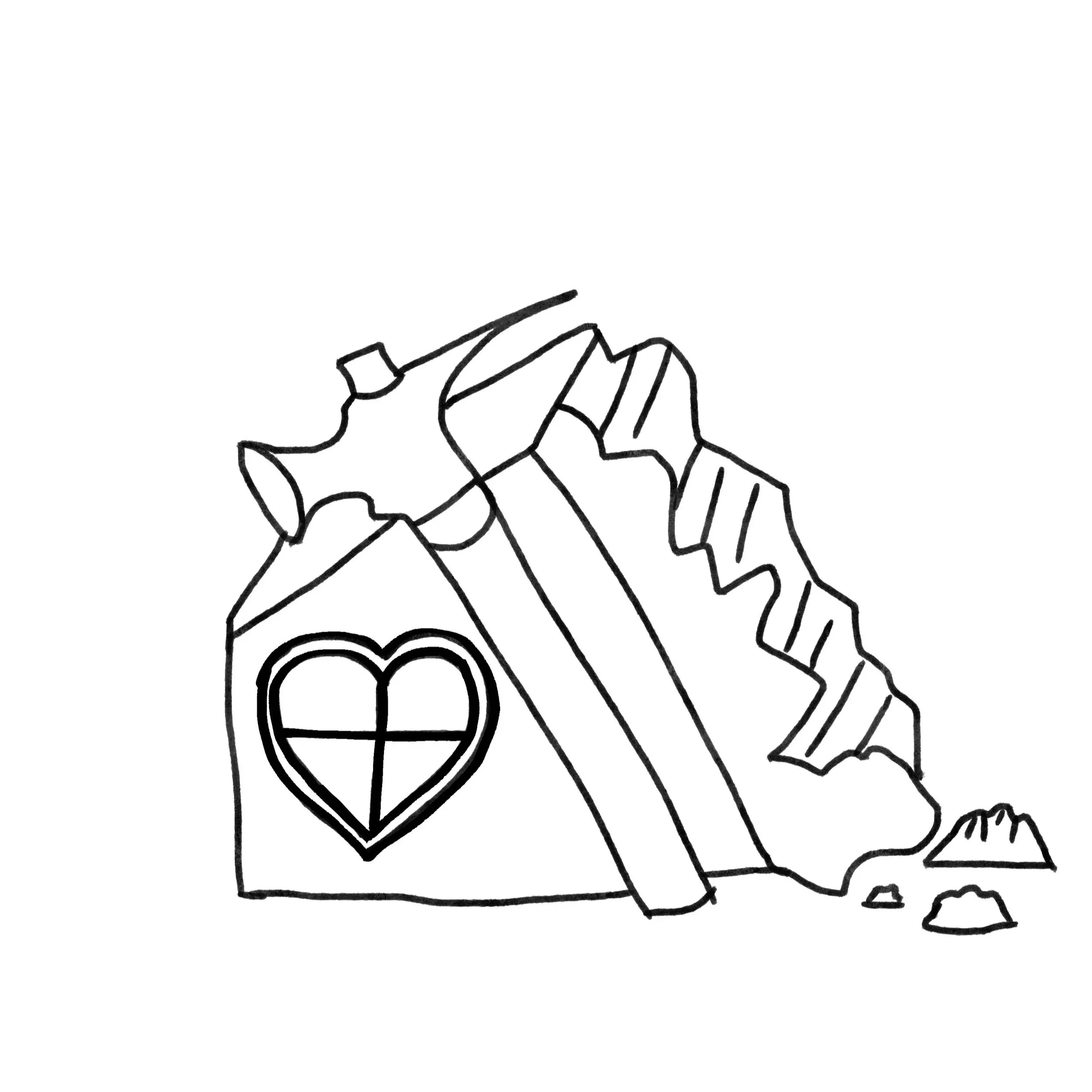
The logo design began with concept exploration, focusing on the core themes of strength, stability, and community.
The initial rough draft incorporated visual elements such as a solid rock foundation paired with housing structures to symbolize dependable and affordable living.
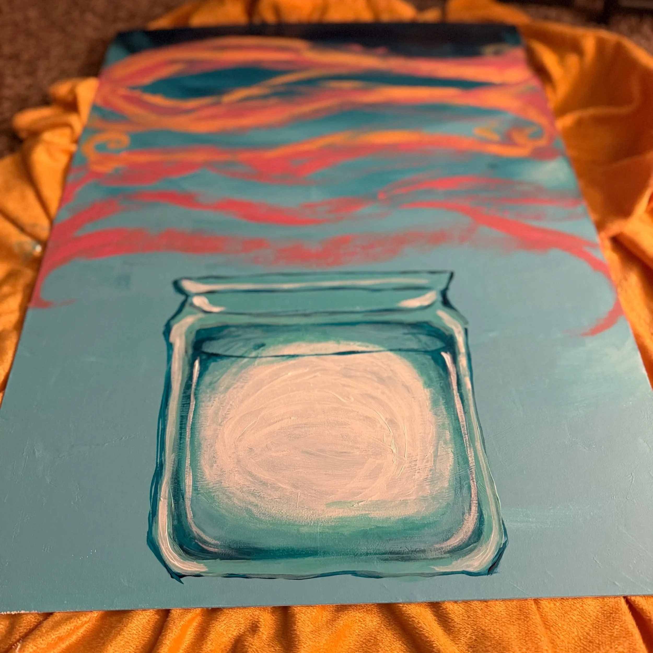
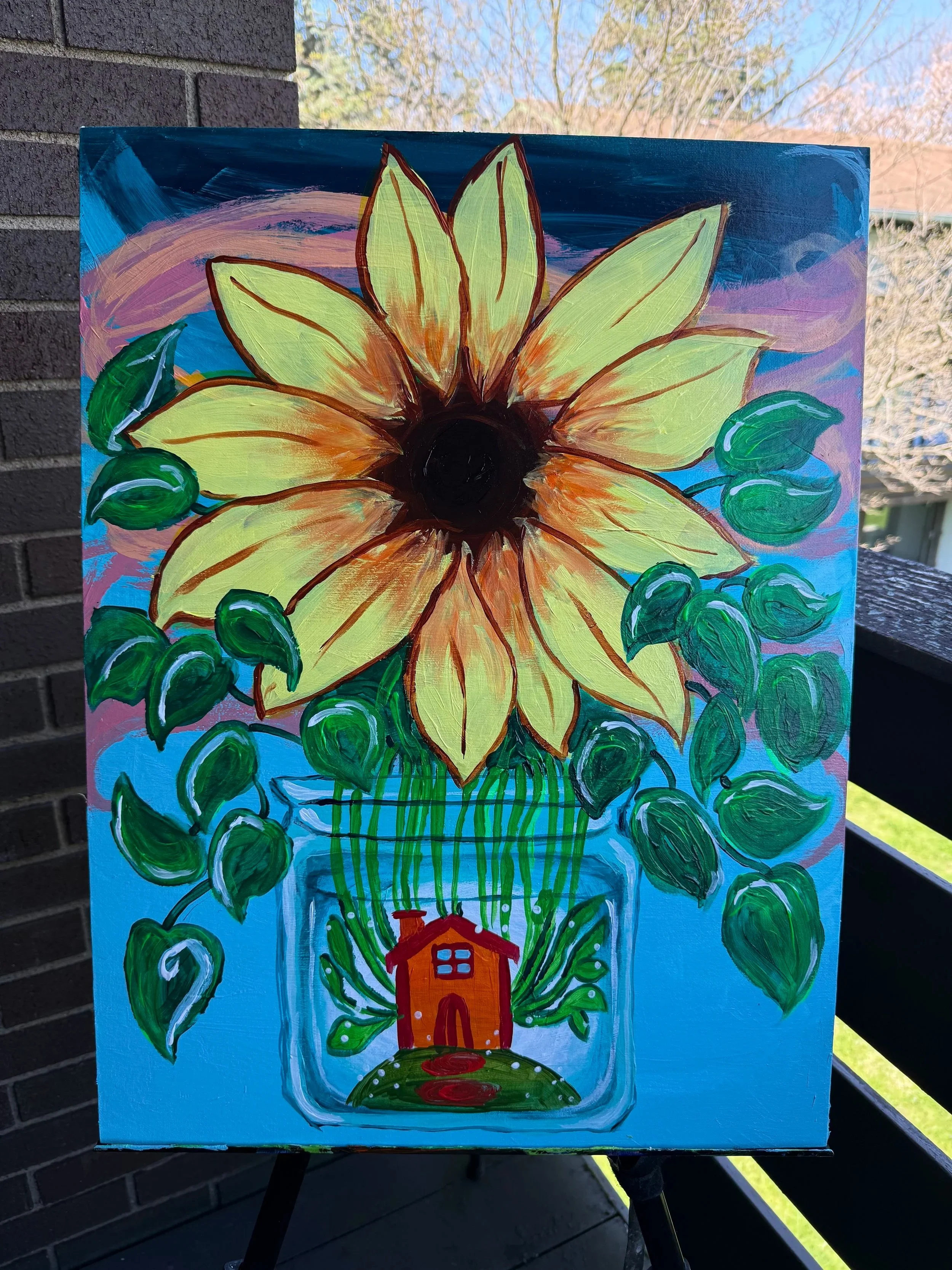
The painting process began with preparing an 18x24 canvas, applying a smooth base coat to create an even surface for the acrylic layers.
A light pencil sketch was then used to outline the sunflower’s placement, focusing on strong composition and visibility for public display.
Next, the background was painted in layered tones to create depth and contrast, ensuring the sunflower would stand out as the focal point. Broad brushstrokes were used first, followed by blended layers to soften transitions.
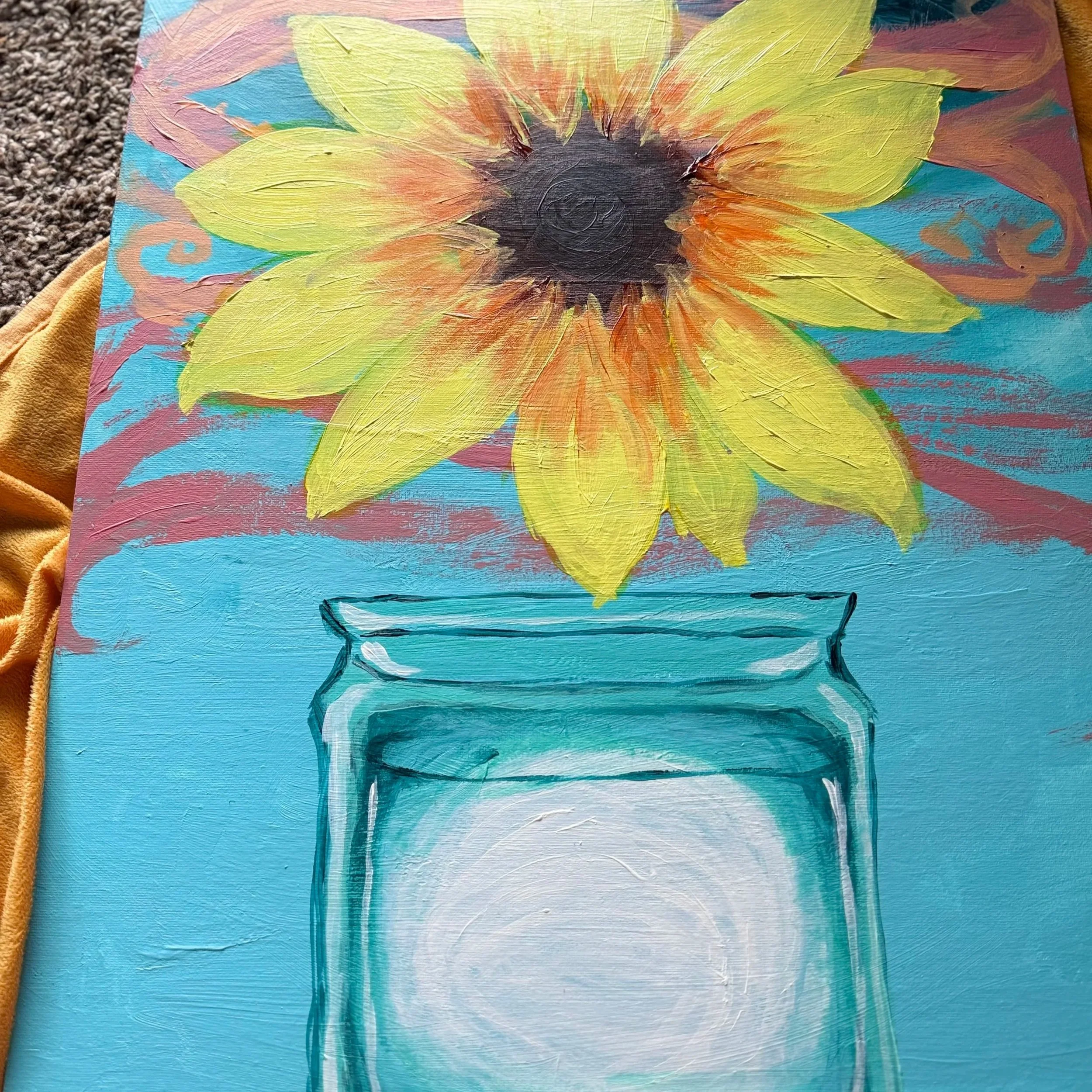
The sunflower petals were built up in stages using warm yellows and oranges, adding dimension through highlights and shadows. The center of the flower was developed with textured brushwork, using deeper browns and gold tones to create a natural, tactile look.
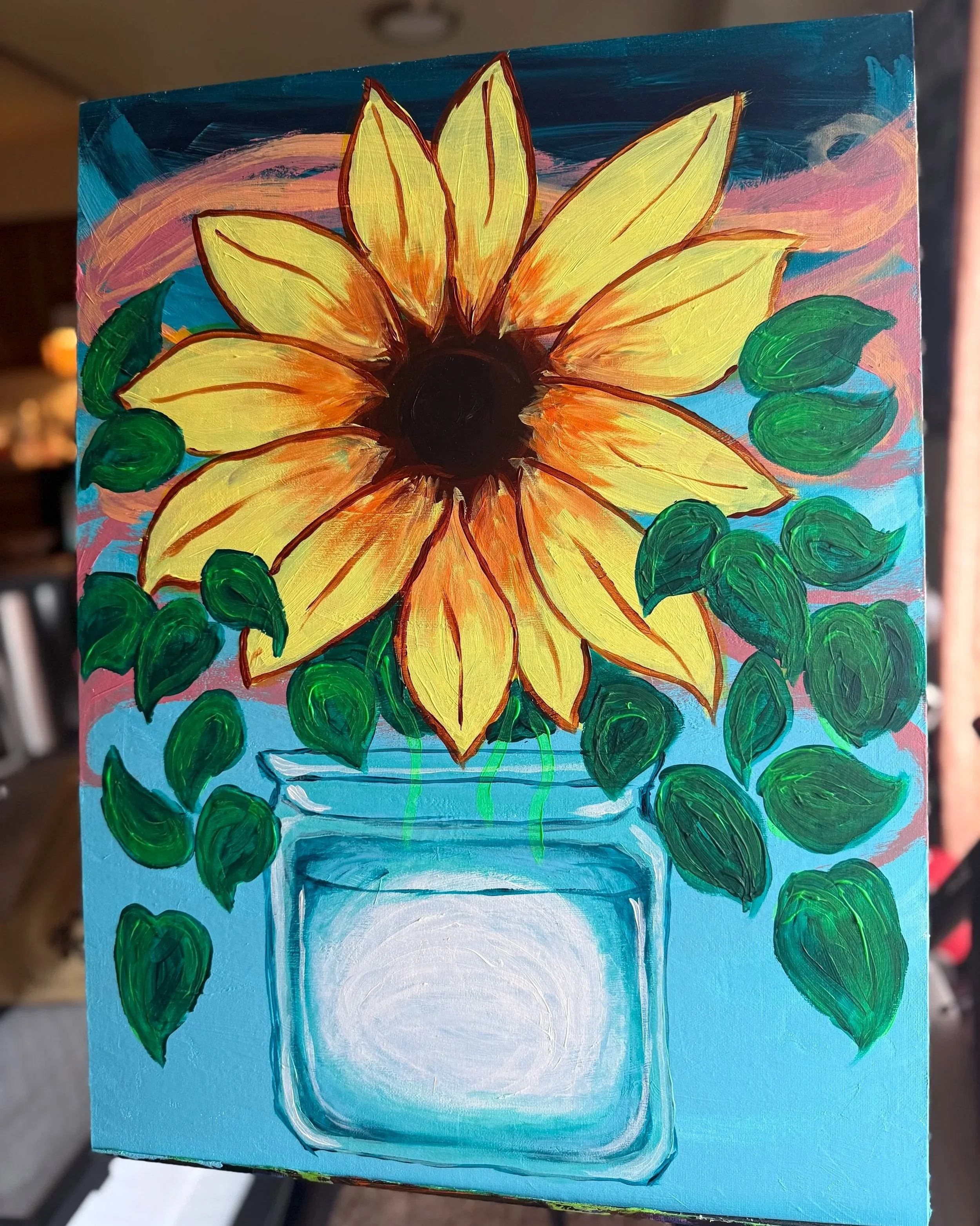
Details were then refined across the piece, enhancing petal edges, adding subtle highlights, and defining the stem and leaves with rich greens for balance.
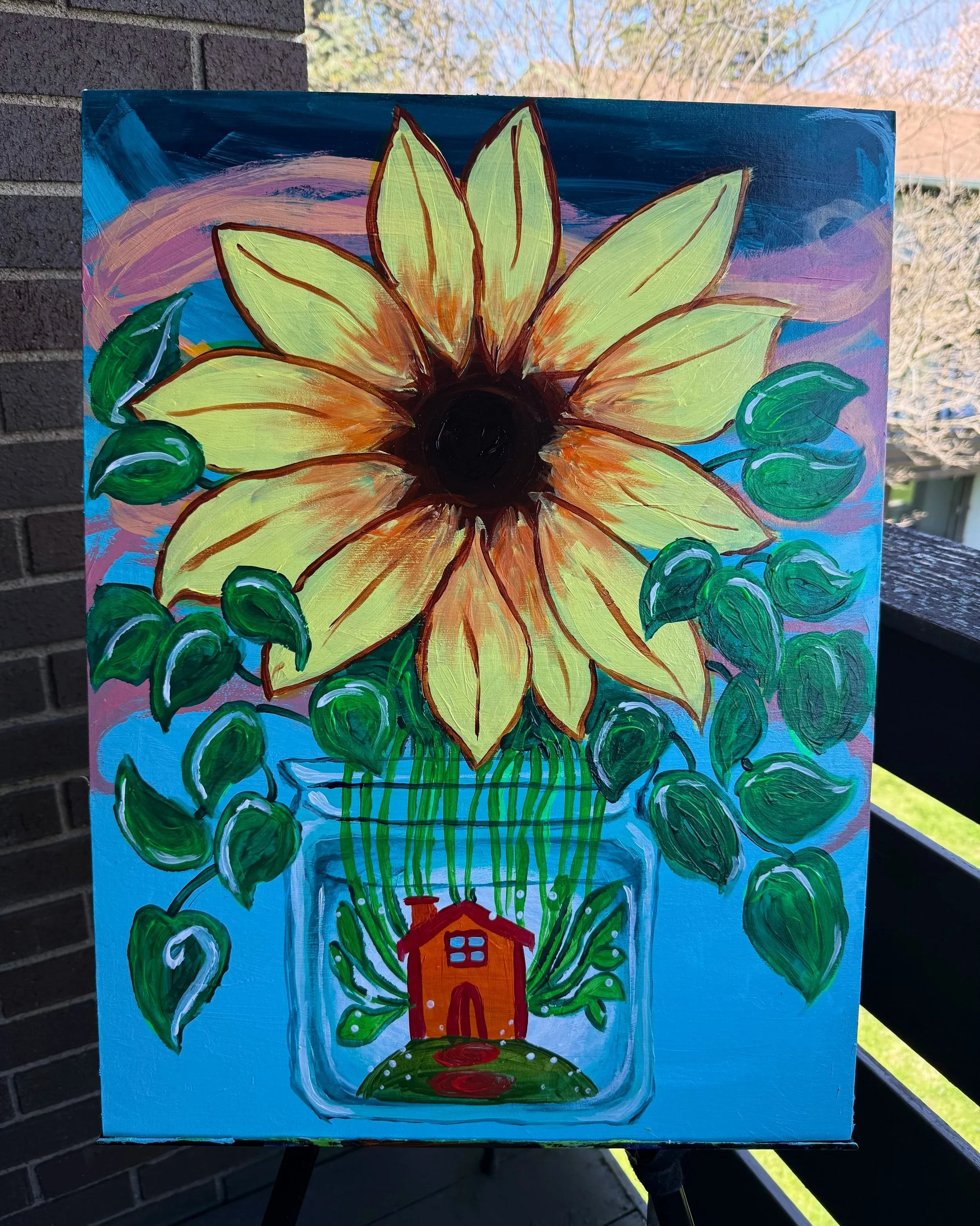
Finally, the painting was sealed with a protective varnish to preserve color vibrancy and durability, ensuring the artwork remains impactful and long-lasting for public nonprofit display.

@STERLING-ARTISTRY
Final Piece completion 4/12/2026
Peter the Rock Community Building Projects LLC
is a mission-driven development company dedicated to creating quality, affordable housing for communities in need.
Focused on building homes that are both accessible and sustainable, the company is committed to making homeownership more attainable.
In support of this mission, for every three homes sold, a fourth home is contributed to a nonprofit partner—either donated at no cost or provided as zero-charge housing—helping expand access to safe and stable living for individuals and families.
@STERLING-ARTISTRY
The final logo combines a strong rock foundation with a home structure, symbolizing stability, resilience, and affordable housing. The clean, balanced design reflects trust and community impact.
The use of orange represents warmth, optimism, and generosity—highlighting the company’s mission to uplift communities and give back by providing housing opportunities for those in need.